Primary navigation
The main menu bar: plain links, the current section, and items that open a mega panel. Panels open on hover or click, and screen readers hear when one is open.

GovTheme is an agnostic design system any government agency can make their own. It's a Drupal theme: run it free on your own Drupal or have Doghouse host, secure and support it on Doghouse SaaS. Colour, fonts, shape, density and elevation are all live: open the Customiser and watch the whole system respond. Built to WCAG 2.2 AA and mobile-first.
Semantic colour tokens, not raw hex values. Pick a palette or your own brand and accent colours in the Customiser, and the engine derives the hover, active, tint and on-colour shades, with the contrast of each pairing checked live.
One type scale, from fine print to hero titles, for headings and body text. Choose the heading font and body font separately in the Customiser; serif headings set their own weight and letter-spacing.
Introductory paragraphs use a slightly larger size to ease readers in.
Paragraphs and lists in page content.
Captions, metadata and helper text.
A 4px spacing scale that keeps the rhythm consistent. The Density setting in the Customiser (comfortable or compact) scales control heights and padding without breaking the grid.
Corner radius for buttons and cards, set separately by the Buttons and Corners settings in the Customiser, from sharp corners to pill-shaped buttons. Inputs follow the card corners; badges and tags stay fully rounded.
Three shadow levels, small to large. The Elevation setting in the Customiser (flat, soft or raised) makes the same components read as print-like or app-like.
The full line icon set, drawn on a 24px grid with a 2px stroke. Icons take the colour of the text around them, so they keep its contrast.
Inline links, underlined in body text, and arrow links for standalone navigation.
Primary, secondary, ghost, subtle and danger buttons in three sizes, with or without an icon. They follow the Buttons and Density settings; at comfortable density, default and large buttons are at least 44px tall.
Badges for status, such as a page's place in the editorial workflow, and tags for categorising and filtering content by taxonomy.
Text inputs, selects, a text area, checkboxes, radios, a switch, file upload and a progress bar. Every field has a visible label and focus state, and can take a hint and an error message.
A loading indicator for searches and form submissions, labelled for screen readers. Pair it with visible text wherever there is room.
Information, success, warning and error alerts, for Drupal's status messages and notices editors add to a page, plus a plain default panel. Each of the four types pairs its colour with an icon, never colour alone.
Applications must be submitted through the online portal before 5:00pm Galactic Standard Time.
Thank you for your submission on the Vega Hyperlane Upgrade. Your reference number is VHU-2127-04821, and a copy has been sent to your email.
A minor solar flare may delay Vega hyperlane services until 1800 Galactic Standard Time.
Enter your email address, and choose what your submission is about.
Report a delayed or missing shipment, or check the current corridor status, through the infrastructure team.
Site-wide messages at the top of the page for consultations, service updates and emergencies, shown on a schedule. Visitors can dismiss them unless an editor turns that off; each type pairs its colour with an icon, never colour alone.
Downloadable files, with the file type and size shown up front.
A pull quote with its source, for news and other long-form content.
This is the largest single investment in frontier connectivity in the department's history, and it will help communities across the Vega Sector thrive.The Hon. Amelia Vega MP, Minister for Interstellar Planning and Infrastructure
An organisation's values as a row of chips, for vision and about pages.
Key figures in a grid, for vision, about and strategy pages.
Expandable sections for FAQs and dense reference content. They work by keyboard and announce whether they are open; a closed section's contents are hidden from the keyboard and screen readers.
Most applications are assessed within 8 weeks of lodgement. Applications referred for public comment may take longer.
Yes. Minor amendments can be lodged through the portal at any time before a decision is made.
You can request a review or lodge an appeal within 28 days of the decision. See the planning help desk for guidance.
Related content in panels on one page, for service and program pages. Arrow keys move between tabs, following the standard tabs pattern for screen readers.
The Regional Galaxy Growth Program helps fast-growing regions outside the Core Systems diversify their economies, house their workforce and connect to reliable digital and communications infrastructure. It's aimed at regions where population growth is outpacing local services and housing supply.
Applications are open to:
You'll need your regional growth plan, budget and evidence of co-contribution before you begin.
Applications must be submitted through the online portal before 5:00pm Galactic Standard Time.
Data tables for structured content. A table too wide for its column scrolls sideways inside its own frame, so the page never does.
| Region | Scheme | Status | Last updated |
|---|---|---|---|
| Core Systems | Core Systems Metropolitan Scheme | In force | 3 February 2126 |
| Inner Colonies | Inner Colonies Growth Scheme | In force | 19 July 2126 |
| Frontier Territories | Frontier Territories Planning Scheme (draft) | Public comment | 15 September 2127 |
| Outer Rim | Outer Rim Settlement Scheme | Under review | 2 April 2125 |
The path from the home page to the current page, for deep site structures. The current page is marked for screen readers.
Page links for long listings and search results. The current page is marked for screen readers.
A pop-up search, opened with ⌘K (Ctrl+K) or from any search box. Results are grouped by the site's own categories and work by keyboard; before you type, it can suggest common pages.
Cards for news, programs, regions, services, child pages and people, plus step and feature cards for landing pages. All share the Corners and Elevation settings, and every linked card shows a clear focus ring.
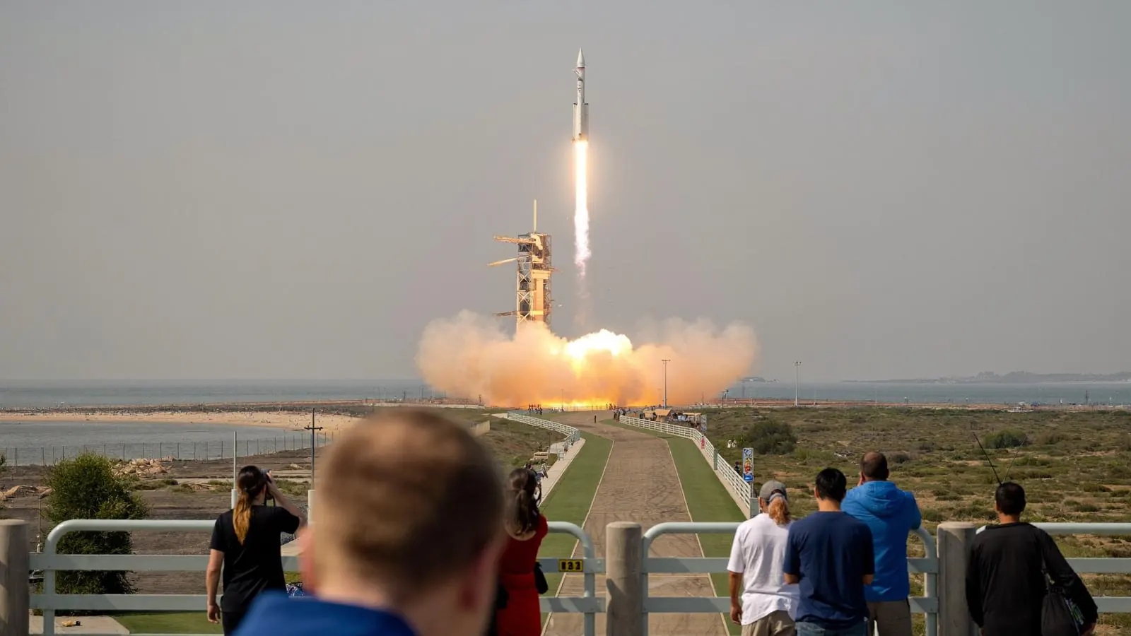
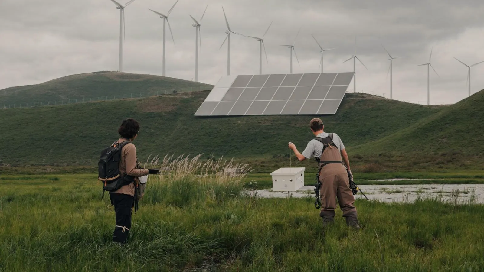
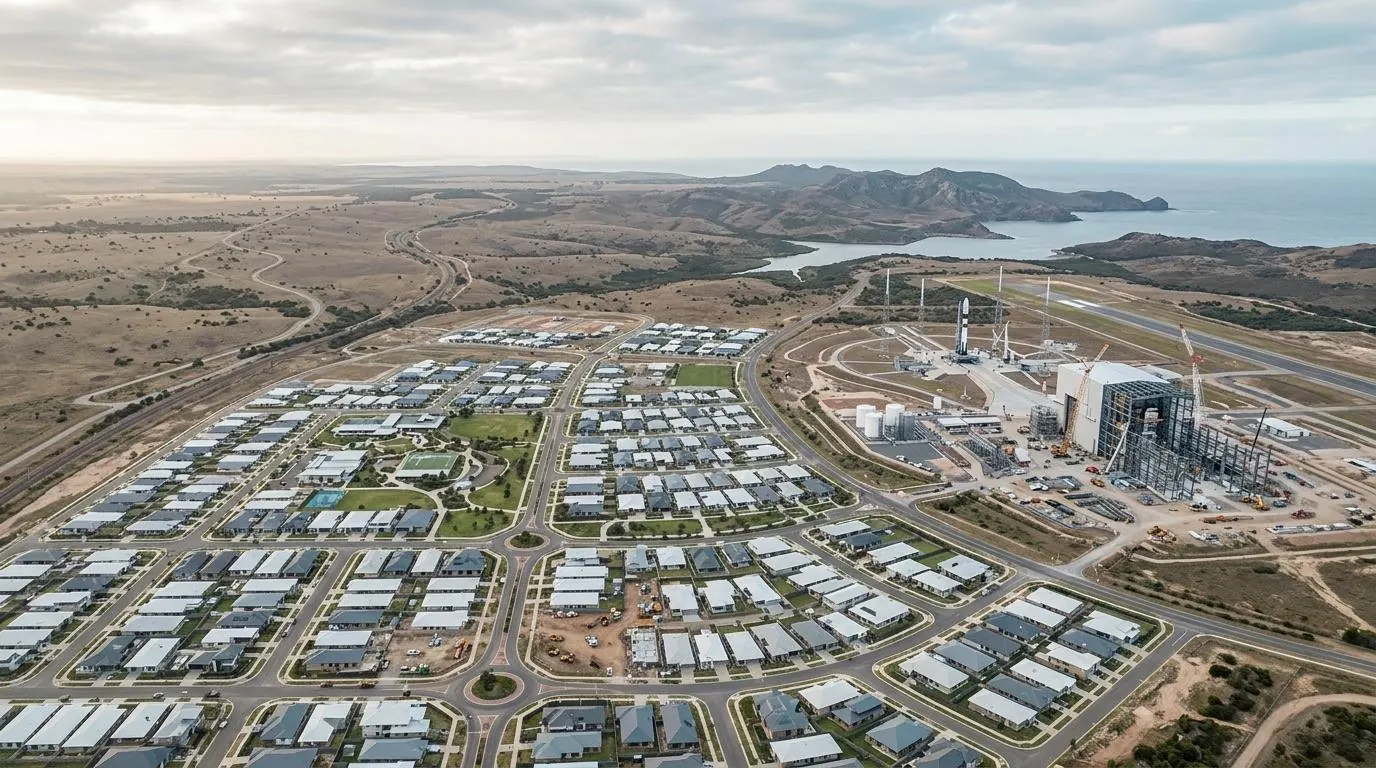

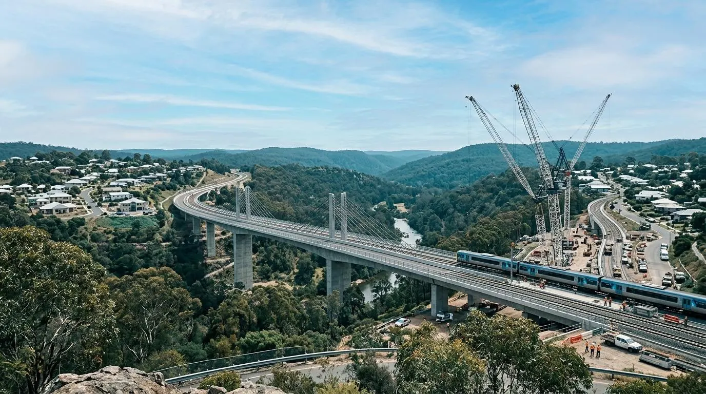
The Commonwealth Government has announced investment in a new transport corridor connecting three rapidly growing colonies across the Vega Sector.
Read more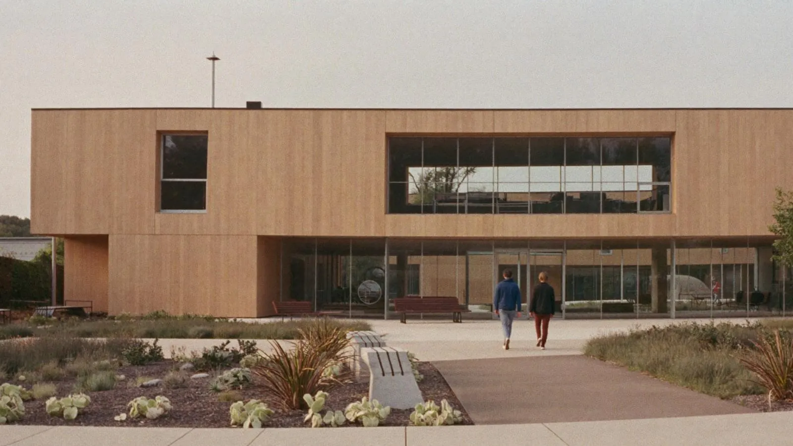
Residents are invited to provide feedback on future housing needs across frontier settlements.
Read more
The department is seeking community feedback on a proposed second orbital transport hub for the Core Systems.
Read moreSurface and orbital ports that move people and freight between worlds.
Protected freight and passenger routes linking the inhabited systems.
Inter-system supply chains keeping colonies stocked and supplied.
Applications, permits and schemes
Spaceports, hyperlanes and freight
Consultation, housing and growth
Funding, grants and delivery programs
Infrastructure delivery — transport, utilities and community facilities — for emerging settlements on the frontier.
Grants for renewable energy, ecological protection and water and waste systems.
Funding for new surface terminals and orbital hub upgrades to keep pace with growth.
Event cards with a type badge and a register button, and a compact dated list of news headlines.
Search results beside a filter rail, with a count on each filter. The layout Drupal's search and facets produce.
The Commonwealth Government will invest in a new transport corridor connecting three rapidly growing colonies across the Vega Sector, improving freight and passenger movement…
Protected freight and passenger routes linking the inhabited systems, including the proposed Vega–Proxima upgrade now open for consultation…
The title band at the top of landing pages, news and events: title, subtitle and an optional image. Shown here with and without an image; news and events add category badges and a row of details.
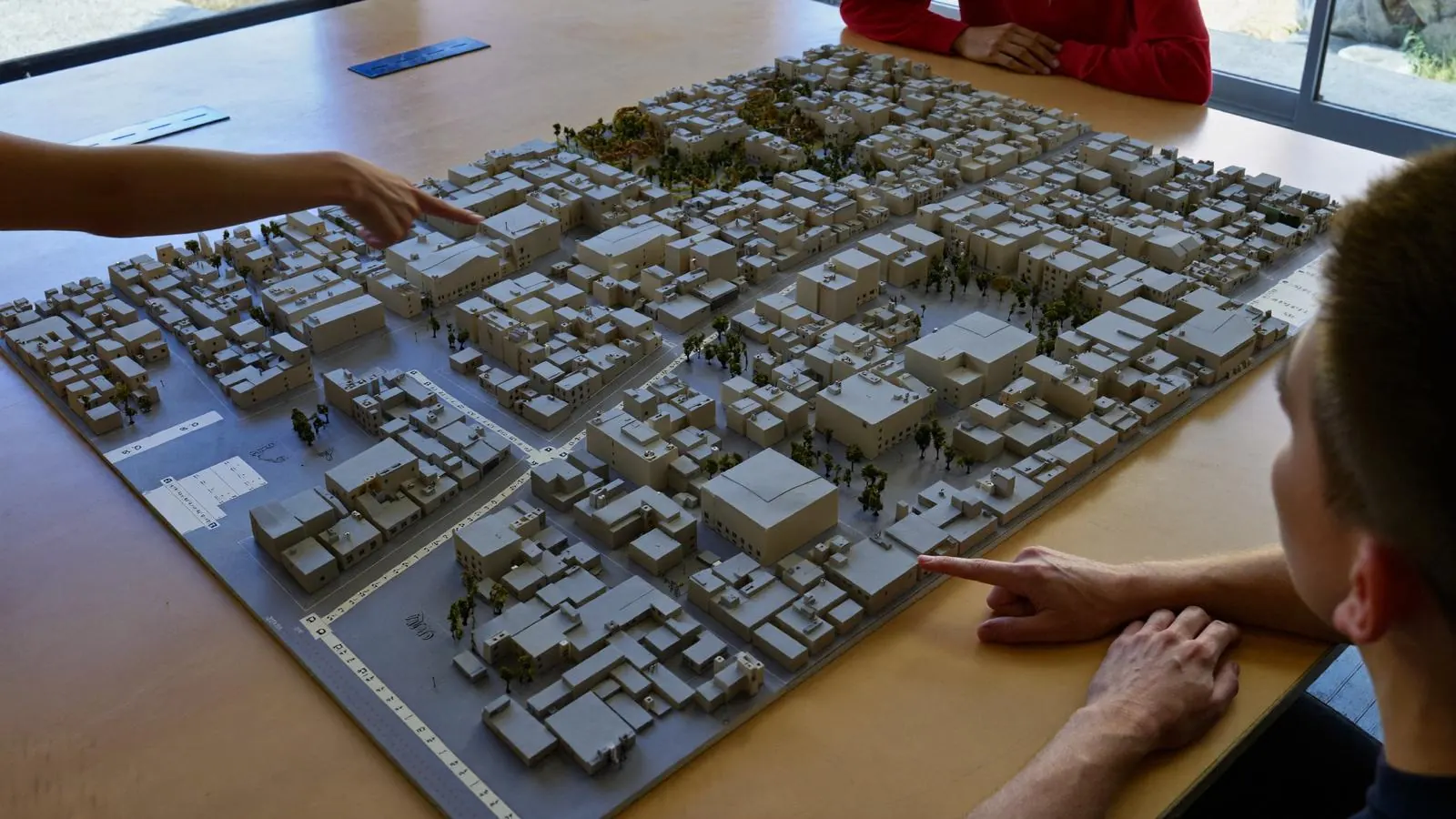
Four hero layouts, split, centred, feature and minimal, chosen for each hero block. Each keeps the title, lead, buttons, site search and popular searches; only the composition changes, and minimal has no image.
The Department of Interstellar Planning works with governments, industry and communities to support sustainable growth across the Commonwealth's 128 inhabited systems, from the Core Systems to the last stop before the Outer Rim.

The Department of Interstellar Planning works with governments, industry and communities to support sustainable growth across the Commonwealth's 128 inhabited systems, from the Core Systems to the last stop before the Outer Rim.
The Department of Interstellar Planning works with governments, industry and communities to support sustainable growth across the Commonwealth's 128 inhabited systems, from the Core Systems to the last stop before the Outer Rim.
An image spotlight for consultations and campaigns, and a call-to-action band, shown on the page background and inside a dark band.

We're seeking feedback on plans to improve freight and passenger movement between the Vega and Proxima regions. Your feedback directly informs where and how we invest.
See how growth is tracking across Core Systems, the Inner Colonies, the Frontier Territories and the Outer Rim.
See how growth is tracking across Core Systems, the Inner Colonies, the Frontier Territories and the Outer Rim.
The header and footer that frame every page. The footer opens with the Acknowledgement of Country, then the logo and tagline beside the site menu, then the legal links.